Have you ever thought about how your preferred websites seem flawlessly on all devices—desktop, tablet, or smartphone? The secret to this magic is responsive web design, an essential strategy that guarantees your website will work smoothly on all screen sizes and offer the best possible user experience.
A mobile-first responsive website design is not only advantageous but absolutely necessary given the rise in the use of smart mobile devices. It is important to verify that your website is responsive because more people are using mobile devices to access the Internet than ever before.
According to Statista, In 2023, mobile devices account for up to 57% of all internet traffic worldwide. Fortune Business Insights projects that the global smartphone industry grow at a compound annual growth rate of 7.3%, from $484.81 billion in 2022 to $792.51 billion in 2029.
The days of having a website with hardly any updates are gone; with the increase in mobile usage, businesses need to cater to the demand for better online experiences with the concept of mobile first responsive design which is based on the idea of mobile first.
Keep in mind that your web design must handle tablets, 2-in-1 laptops, various-sized cell phones, tablets, and laptops.
With mobile-first responsive design, your website will always appear at its best, improving user experience, increasing conversions, and propelling business expansion.
To maintain competitiveness and improve audience engagement, businesses need to get web design and development services from a reputable website development company that specializes in creating user-centric, responsive, and high-performing websites tailored to their specific needs and industry standards.
This article will discuss mobile-first web design, going over its essential elements, and recommended practices. So, let’s get Started!
What is Mobile-First Web Design?
Mobile first concept as the name implies is a process in which a website interface is first designed with mobile in mind and then scaled up for large-screen devices. It contributes to enhancing mobile usability by taking into account the prospects and challenges of mobility at the first stage.
Developers and designers are acknowledging the growing number of mobile consumers worldwide with this strategy. They work hard to develop engaging websites and apps that run well on smaller displays so they can provide consumers with flawless digital experiences across all platforms.
Mobile-first design is mostly based on two crucial principles:
Progressive Enhancement
Initially, this strategy concentrates on designing for the most limited platform, which is the mobile device. Designers make sure that the user experience is simplified by giving priority to features and functionality that are necessary for smaller displays, such as flexible design components, and easy-to-use navigation.
More features and intricate designs may be incorporated as the design expands to fit larger displays without degrading usability on mobile devices.
Graceful Degradation
On the other hand, gentle degradation starts with a bigger screen design and then modifies the features and layout to accommodate smaller displays. This strategy makes sure that even when components are resized for mobile devices, the desktop experience is stable and useful.
In short, graceful degradation is an approach to preserve performance and usability across various platforms by deliberately making design adjustments for smaller screens and reducing the content.
Why Embracing Mobile-First Web Design is Significant for Captivating Your Audience?
That mobile-first is not just an emergence, but the necessity for today’s organizations to be effective in the mobile-oriented markets.
According to a Statista survey conducted in 2022, the number of unique mobile internet users has surpassed five billion, implying that more than 60% of the global Internet population uses mobile internet. As a result, consumers are more likely to purchase and revisit brands with mobile-optimized websites.
With the number of mobile users increasing every year, creating web applications based on mobile first allows designs to remain engaging, available, and effective. Here’s why adopting mobile-first layouts is important:
Enhancing User-Centricity
Mobile-first design is a strategy that prioritizes user experience and makes fundamental functions fit on tiny displays.
This approach ultimately improves usability and pleases users by using adaptable design principles and being built on an intuitive approach to navigation and other necessary elements such as search and menu.
Adopting this user-focused strategy ensures that mobile users can quickly access and engage with your site, hence enhancing overall usability.
Optimizing Performance from the Start
The mobile-first web design approach naturally involves speed optimization from the beginning of the process. It compels organizations to consider the loading time, performance, and responsiveness of their systems.
Such features are especially useful for mobile users who often utilize cellular connections and want rapid results. When the site is designed with performance in mind from the start, you ensure that all users experience improved performance.
Adapting to a Mobile-Dominant Market
Unquestionably, more individuals are using smartphones and tablets to access the internet, indicating a move towards mobile consumption. You may reach this important audience by adopting a mobile-first design.
Ignoring mobile design can make a big part of your audience uncomfortable, which could result in lower engagement and sales. Making your digital presence mobile-first guarantees that it is readable and appealing to the increasing number of mobile consumers.
Supporting Strategic and Sustainable Growth
Mobile optimization does more than improve the present user experience; it also prepares your digital resources for future use. With the continuous popularity of smart devices such as phones and tablets, using a mobile first responsive design strategy ensures that the website or application’s fundamental layout stays functional and entertaining.
As a result, focusing on mobile optimization allows for solid, planned development while also maintaining knowledge of current and future user activity.
Enhanced Search Engine Visibility
Google favors mobile-friendly websites, therefore the mobile first web design strategy is an important tool for improving your website’s visibility and placement in SERPs. Increased exposure improves a website’s status and draws visitors, which is a measure of a business’s effectiveness.
Boosting Sales
The fact that 56% of all sales are now completed via a mobile device shows mobile commerce is growing. This trend highlights the necessity for a mobile-responsive design to attract and convert mobile clients, which has a direct impact on your ROI.
Wider Audience Reach
Web designs that prioritize mobile devices are incredibly powerful tools for companies trying to grow their online presence and attract more customers. By concentrating on mobile, you may reach the bulk of consumers, as Statista reports that over 50% of all online traffic originates from mobile devices.
If you ignore mobile design, you run the risk of offending a sizable portion of your audience and losing engagement and revenue.
Driving Innovation
You know, adopting a mobile-first strategy forces teams to keep ahead of modern user demands. It all comes down to being adaptable and creating creative concepts that look great even on such little screens.
When you design with mobile in mind from the beginning, you wind up with creative solutions to issues that enhance the user experience for all users, whether on a desktop, tablet, or phone. It’s similar to making oneself think creatively to improve your website or application for all users.
Responsive Web Design And SEO
In addition to improving search engine optimization, mobile first web design guarantees that a website’s content and layout adjust to various screen sizes without breaking. Adopting a mobile-first strategy will improve your search engine rating and generate organic traffic since Google prefers mobile-friendly websites in search rankings.
Lower Bounce Rates
When information is easily available and legible on mobile devices, people are more likely to stay on a website and engage with it, which often results in reduced bounce rates. Which is usually preferred by search engines, and can improve search engine ranks.
94% of a website’s first impression is shaped by its design, so it’s significant to grab users’ attention right away. Moreover, the layout needs to take customer attention into account, as 88% of visitors will never return to the website if they have a bad experience.
These figures demonstrate the importance of mobile-first web design to improve the first look as well as maintain the existing attention of the target market.
Enhancing Progressive Web Apps (PWAs)
Progressive Web Apps, or PWAs for short, are applications that are created with a greater focus on the mobile web. PWAs, as opposed to native apps, provide the ease of mobile web use without sacrificing performance, consistency, or the requirement to install apps from the app store.
PWAs ensure a perfect experience on mobile devices as they are designed under the mobile-first concept. Furthermore, PWAs eliminate the need for specific native applications and can be up to 75% cheaper in development and maintenance for businesses.
Mobile-First Design Vs Responsive Design
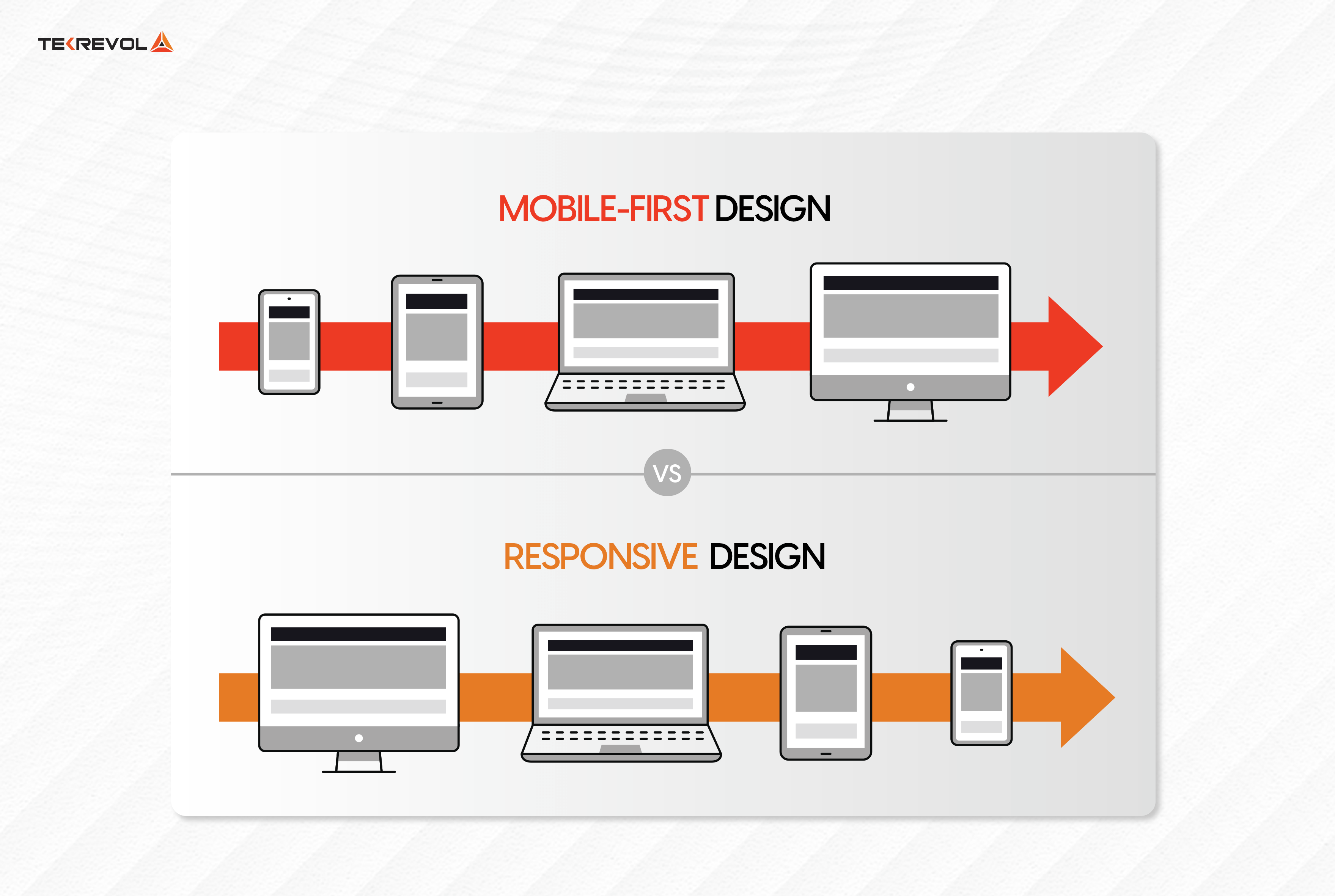
It is important in modern web development to deliver a consistent user experience across tiers. Mobile First design and Responsive design are the two most frequent methodologies used for this.
While they may employ distinct execution methodologies and concepts, both strategies seek to guarantee that websites are well-designed and functional across all platforms.
| Aspect | Responsive Design | Mobile-Fist Design |
|---|---|---|
| Philosophy | Adapts the layout to the user’s device screen size. | Starts with the smallest screen and scales up. |
| Development Approach | Begins with designing for desktop, then adjusts for smaller screens. | Begins with designing for mobile, then enhances for larger screens. |
| Initial Focus | Desktop and larger screens | Mobile and smaller screens |
| Design Priority | Complex layouts optimized for desktop and simplified for mobile. | Simplified layouts for mobile, enhanced for desktop. |
| Media Queries | Uses breakpoints to adjust layout for various screen sizes. | Uses breakpoints to progressively enhance the design. |
| Performance Optimization | Typically optimized for desktop performance. | Typically optimized for mobile performance. |
| Content Strategy | Content is often reduced or restructured for smaller screens. | Content is progressively added as the screen size increases. |
| Use Cases | Websites primarily accessed on desktops. | Websites with significant mobile traffic. |
| Challenges | Result in slower load times on mobile. | Requires careful planning to scale up effectively. |
| Examples | Corporate websites, complex web applications | Blogs, news sites, mobile apps |
8 Best Practices for a Successful Mobile-First Approach
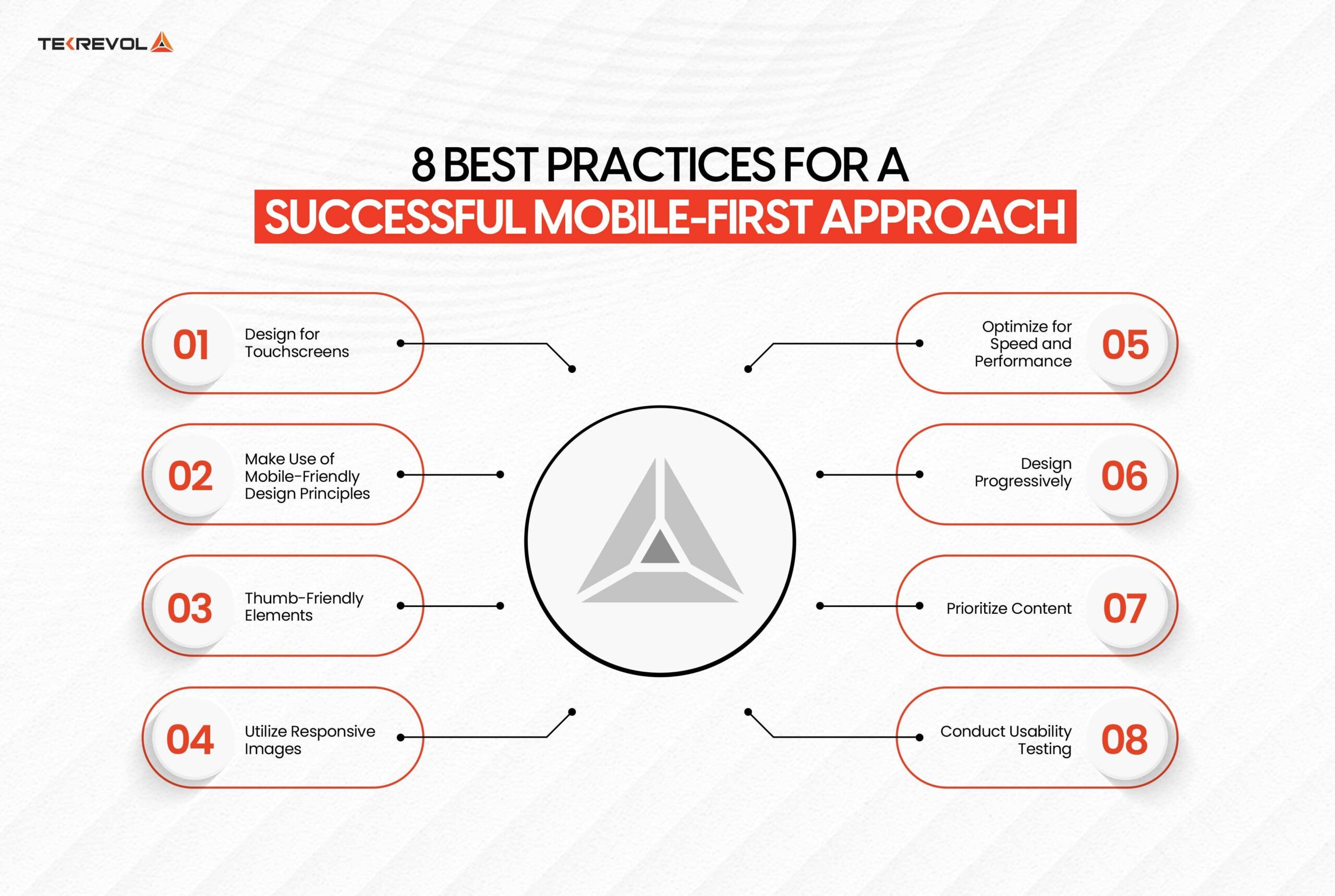
Delivering effective mobile-first designs requires a blend of best practices in design, development, and testing. Here are some strategies to ensure your mobile-first designs make a significant impact:
Design for Touchscreens
Custom Interactions: Take into account touch while designing as the majority of smartphone consumers utilize touch-enabled devices. Consider pinch, swipe, and tap movements, and make sure buttons and interactive components are large enough and placed properly for touch input. Use haptic feedback to improve the user experience and reduce annoyance.
Example: Instead of desktop-centric hover effects, create wide, tappable surfaces and natural swiping movements.
Make Use of Mobile-Friendly Design Principles
Familiar Patterns: Use recognizable design principles, such as card layouts, infinite scrolling, and touch-friendly forms, to make your website mobile-friendly. Users are accustomed to certain patterns, which improve the usability of your mobile website.
Contextual Interfaces: Create user interfaces (such as location-based services) that adjust to the context of use, giving users the features and information that are most pertinent to them at that moment.
Off-Canvas Navigation: To improve user navigation and conserve screen space, use off-canvas navigation that is concealed until engaged.
Expandable Widgets: To organize material effectively without overwhelming the user, utilize interactive features like expandable widgets (such as accordion menus).
AJAX Calls: Utilize AJAX to make asynchronous server requests, which improves user experience by reducing the need for complete page reloads.
Thumb-Friendly Elements
Clickable Components: Icons, buttons, and links are examples of interactive components that should be clickable. Make sure they are big enough to be readily touched with the thumb. It is advised that the dimensions be at least 44 pixels wide and tall.
Spacing: To avoid unexpected tapping, ensure enough space surrounding clickable items. Additionally, think about the “thumb zone”—where consumers interact with their devices most naturally—and position important interactive components there.
Optimize for Speed and Performance
Enhance Load Times: Mobile users demand easy access and smooth communication. To guarantee quick response times and page loads, make sure all graphics, pictures, and videos are optimized. By doing this, the load on servers and browsers decreases and users are given responsive web pages that increase their level of satisfaction and motivate them to return.
Example: To maintain the visual integrity of your interface, reduce the size of your pictures and use responsive design strategies so that text, graphics, calls to action (CTAs), and layouts may all adjust naturally to different screen sizes.
Design Progressively
Start Small and Scale Up: Start with basics that function effectively on tablets and smartphones, then when you have more room, progressively add features and enlarge your design. Create a solid foundation that adapts to different screen sizes and devices without causing issues so that your whole digital environment is consistent.
Create a Resilient Design System: Establish a unified and coherent design system that works with a variety of screen sizes and devices to set up your online presence for long-term development and smooth expansion over time.
Prioritize Content
Essential Content First: Make sure the most important content is seen first on mobile displays. To avoid sending viewers into a state of information overload, organize and simplify your material. This entails determining the most important data and functionalities that consumers want and making sure they are visible and simple to utilize on smaller displays.
Content Arrangement: To help people navigate through your information and quickly locate what they need, establish a clear structure.
Utilize Responsive Images
Adaptive Images: Provide the user with pictures that are the right size for their device by using responsive image solutions. This guarantees that images appear bright and sharp across a range of screen sizes in addition to cutting load times. Depending on the size and resolution of the screen, tools like HTML’s srcset property can assist deliver alternative image sizes, improving the visual experience without compromising performance.
Use SVGs: Where possible, use Scalable Vector Graphics (SVGs) as they scale well without losing quality and typically have smaller file sizes. SVGs are resolution-independent, meaning they look sharp on any screen size, from the smallest mobile device to the largest desktop monitor.
Conduct Usability Testing
Test Under Various Conditions: Assess how your applications and websites function with varying hardware specifications, screen sizes, device orientations, and network speeds. To figure out which design approach is most successful, compare various designs using A/B testing.
Collect User Opinion: While you’re designing and developing, get user feedback to help you make adjustments based on actual user behavior and preferences. Your mobile experience will be functional and user-approved thanks to this proactive strategy.
Essential Tools and Resources for Perfecting Responsive Web Design
The correct tools are needed to make the mobile-first design process more efficient and smooth. You may use these tools to assess your website’s mobile usability, make responsive designs, and much more. The following are some excellent choices to improve your mobile-first design approach:
Google’s Mobile-Friendly Test
By examining loading times, responsive design, and usability, this tool assists you in determining whether your website is mobile-friendly. It offers in-depth analyses and practical suggestions for enhancement.
Features:
- User-friendly interface
- Rapid and precise analysis
- Improvements suggested under Google’s policies
- Tricks for mobile device performance improvement
Cost:
- Free to use with no hidden charges
Bootstrap
For creating responsive and mobile-first websites, many use the popular open-source Bootstrap framework. It gives users access to a range of pre-made components, themes, and JavaScript plugins to assist in building aesthetically pleasing and organized websites.
Key Features:
- A responsive grid framework ensures consistent design across all devices.
- Adaptable with Sass and Less, two popular CSS preprocessors
- Simple interface for speedy development
- Large, supportive community
- Compatibility with all modern browsers
Cost:
- Free under the MIT License.
WordPress Themes
WordPress is optimal for the mobile-first approach because it offers a vast choice of responsive themes that adapt to various screen sizes. These are SEO-friendly themes, and it is easy to make changes to any of them.
Features:
- Adjusts itself automatically to different screen sizes
- Extremely flexible for distinctive designs
- Optimized for search engines to improve ranks
- Economical with many free and low-cost options
- Strong community support
Cost:
- The WordPress library offers free themes; premium themes cost between $20 and $100.
HostGator Website Builder
Without requiring a lot of technical understanding, designing mobile-first designs is a breeze using HostGator’s drag-and-drop website builder. It provides a selection of mobile-friendly designs together with integrated capabilities to make creating websites simple.
Features:
- Templates for mobile-responsive designs
- Drag-and-drop user interface
- Integrated e-commerce features
- Performance monitoring analytics tools
- Better search engine optimization with SEO tools
Cost:
- A cost-effective monthly plan (Starter: $3.84/month, Premium: $5.99/month) is offered after the trial period of 21 days.
Adaptive Images
One simple way to make sure that photos are the right size for mobile devices is to use Adaptive Pictures. Optimizing loading speeds and performance, it recognizes the size of the screen and offers the appropriate-sized pictures.
Features:
- Determines screen size automatically
- serves pictures that are the right size.
- Adaptable picture dimensions and gradations
- suitable with the majority of frameworks and CMS
- Simple interaction with already-existing websites
Cost:
- Free to use on GitHub as an open-source project.
- Take the first step towards a mobile-first design for your website.
- Our experts at TekRevol help you develop a Responsive website.
How TekRevol Help You Build a Mobile-First Responsive Website?
In the age when people have their mobile devices next to them at all times, TekRevol employs the latest approaches and technologies to deliver mobile-friendly responsive websites.
Our strategy guarantees that not only does your site look perfect on any smaller screen, but it also works flawlessly across any devices available. Here’s a breakdown of our technical process: Here’s how we help you build a mobile-first responsive website:
Comprehensive Requirement Analysis
We start the process by mapping out the technical requirements and user experience objectives of your project through a thorough requirement analysis. This stage includes:
User Personas: Creating accurate personas to identify the requirements, preferences, and modes of engagement of users.
Technical Specifications: Creating strong technical specifications that include scalability alternatives, security precautions, and performance benchmarks.
Content Strategy: Putting important information first and making sure it’s easily readable and navigable on mobile devices.
Mobile-First Design and Development
Our design and development process includes:
Wireframing and prototyping: To visualize the user flow and layout early on, we utilize tools like Sketch and Figma to generate interactive prototypes and wireframes.
Responsive Design: We use frameworks like Bootstrap, flexible grid layouts, and CSS media queries to make sure the website works on a range of screen sizes and orientations.
Performance Optimization: For quicker load times and more visual integrity, we use responsive images and Scalable Vector Graphics (SVGs). Additionally, we optimize CSS, HTML, and JavaScript to increase overall performance.
Testing and Quality Assurance
We guarantee that your website will function at its best on all platforms. Our QA process includes:
Cross-Device Testing: We use technologies such as BrowserStack to do comprehensive testing on many devices to guarantee user experience uniformity and compatibility.
Usability Testing: we gather user input throughout sessions to improve navigation, interactivity, and information display.
Performance testing: we use tools like Lighthouse and Google PageSpeed Insights, load times, responsiveness, and resource consumption are monitored and documented to ensure optimal performance across a variety of network circumstances.
- Ready to Boost Your Website Visibility?
- Our Web Designers can Help you Implement Mobile-First Responsive Design
Conclusion
As more and more people use mobile devices to access the internet every day, website designers should give priority to mobile users while developing their websites.
In order to take advantage of the significant shift in mobile growth, you need to follow the mobile-first strategy to make sure that your website offers the best possible experience for the growing number of mobile users if you want to increase user engagement and conversion rates.
You should collaborate with a professional web development company to achieve this goal. They will guarantee the correct execution of your mobile-first strategy, which will improve user experience and increase conversion rates for your business.

 3939 Views
 July 11, 2024