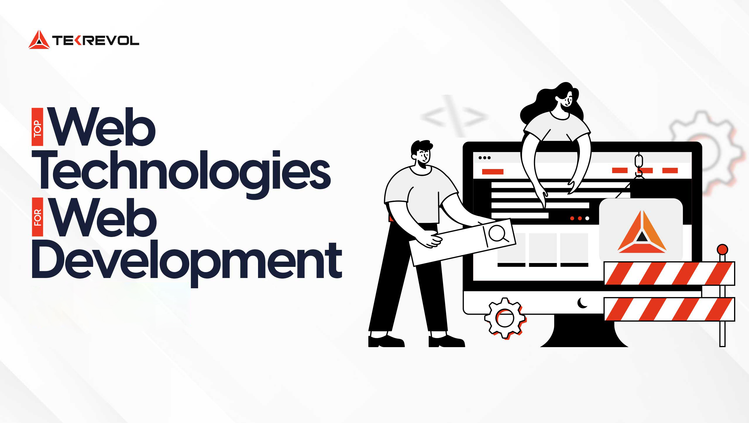
Today users engage with websites through a wide range of devices and therefore, a consistent user experience is highly desirable. Responsive web design (RWD) is at the head of this mission, making certain that any website can easily adjust to any screen size and resolution.
It becomes crucial when you want to go to the next level of understanding or receive profound technical advice on how to achieve the best results for your resource in various contexts and interfaces.
Working with a Website Development Company can be beneficial to your responsive design project, as it adds professional experience and knowledge to the development of a site that both looks good and functions correctly.
Starting with adaptable columns and rows, fluid images, and media queries, we will discuss all the concepts that will help you set up an impressive website that will look great on any platform chosen by a visitor.
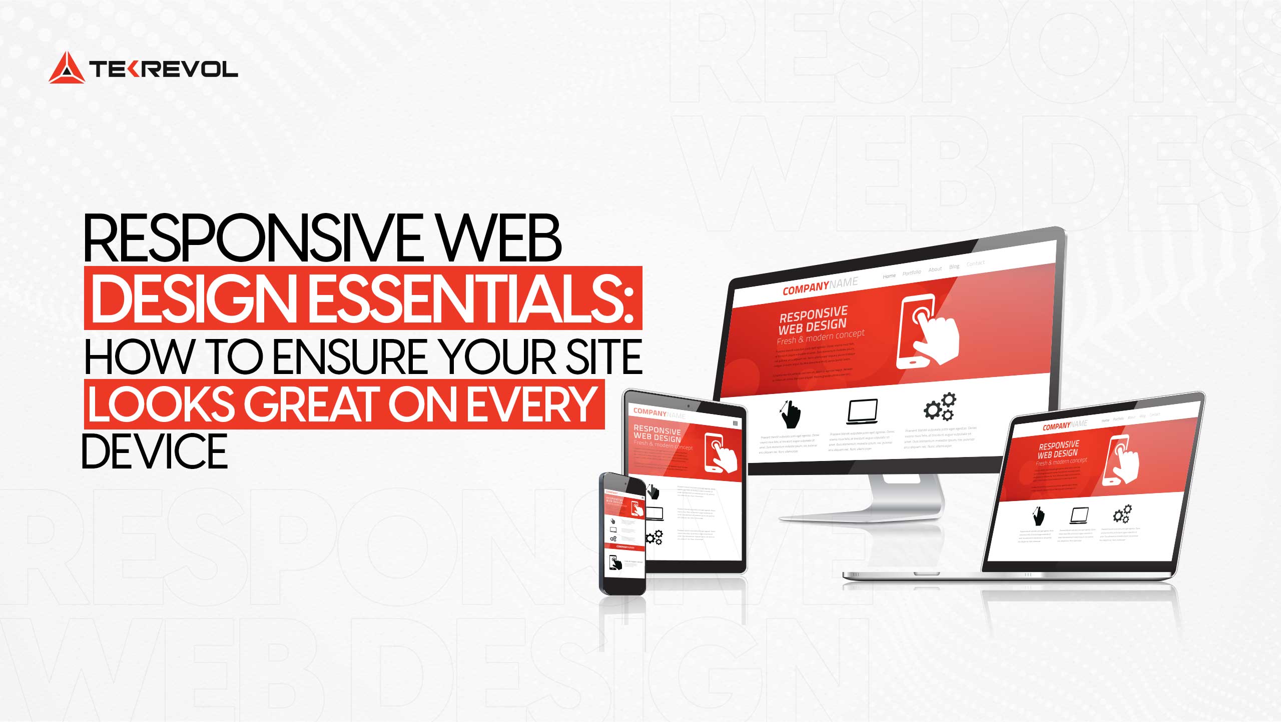
Understanding Responsive Web Design
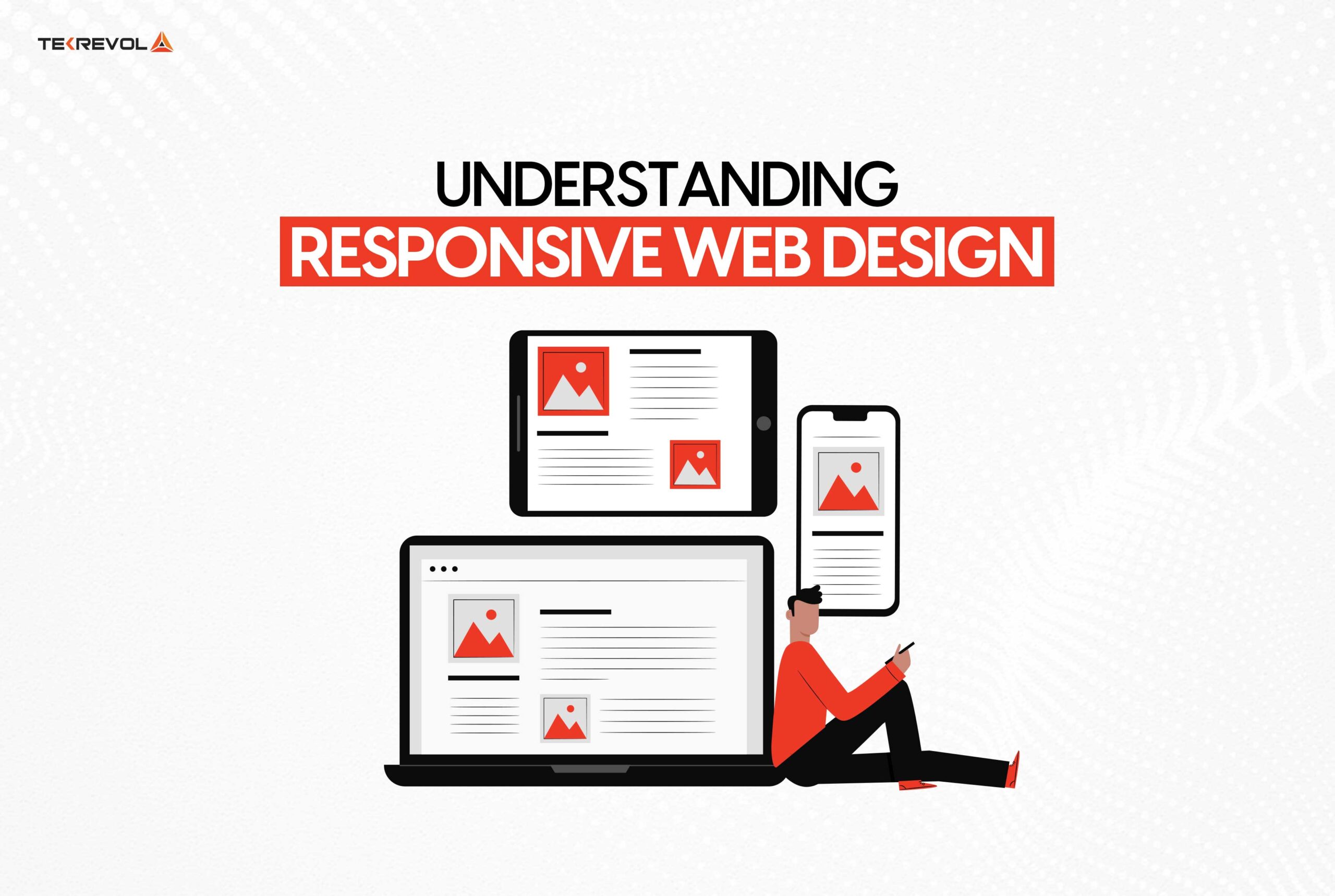
Responsive Web Design (RWD) is the practice of designing and/or developing Web pages with the flexibility to resize and reorient depending on the device being used to view the page.
The main aim is to make user interface and interaction across the devices familiar and understandable in order to work on the website. All this is done through the utilization of fluid grid layouts, responsive images as well as through media queries in cascading style sheets commonly referred to simply as CSS.
The Importance of Responsive Web Design
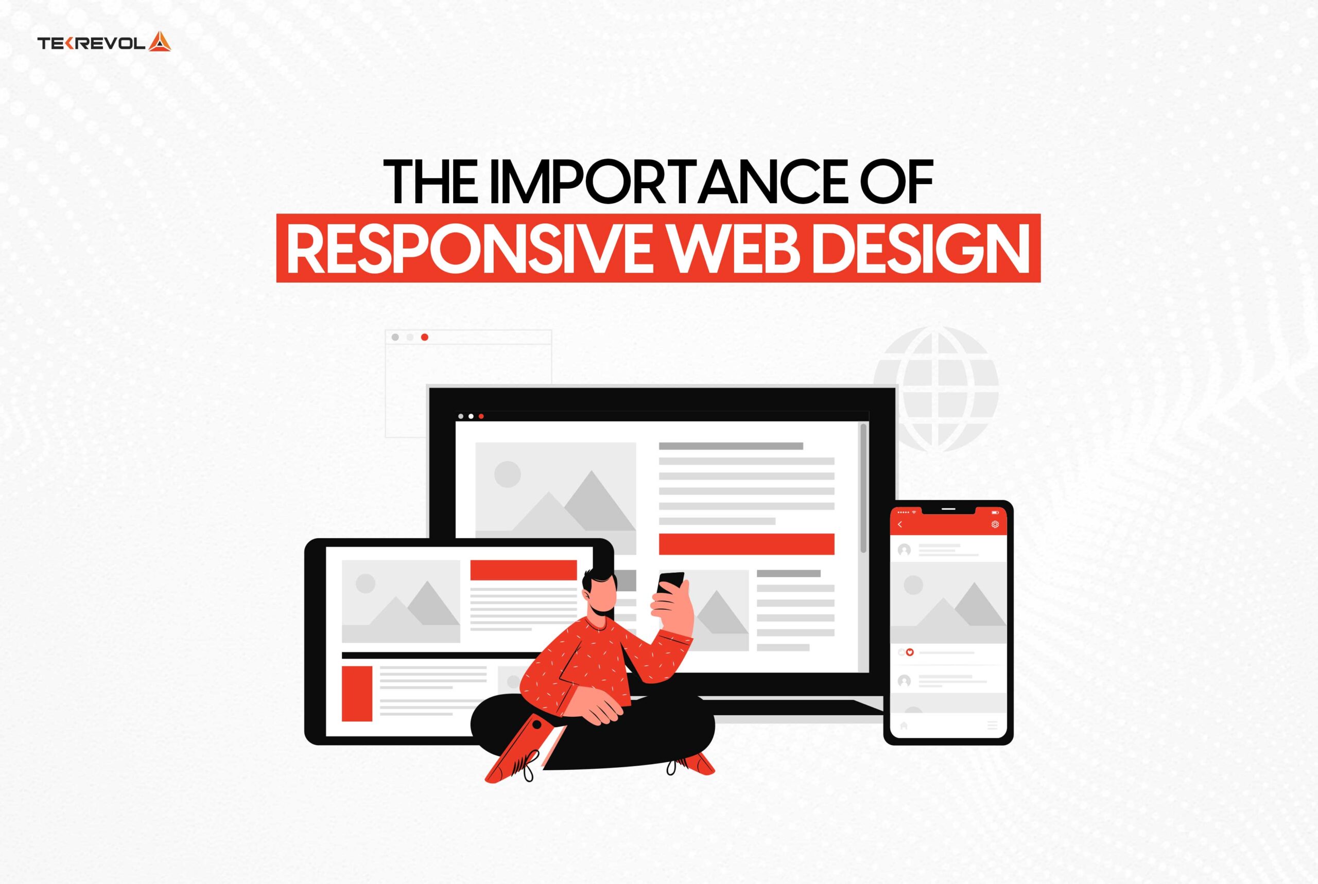
It will also explain why responsive web design is such a crucial concept to understand. As mobile internet usage has emerged as more popular than desktop usage, creating designs that look great on small screens is essential. Not only does this increase the level of customer satisfaction, but it moreover has a direct bearing on the Search Engine Ranking positions within your site.
Google has also incorporated responsive design into its algorithm and this makes responsiveness a crucial aspect of your e-business planning. Responsive web design does not just expand the number of people who can access your website, it also optimizes interaction and sales.
Responsive Web Design vs Adaptive Design
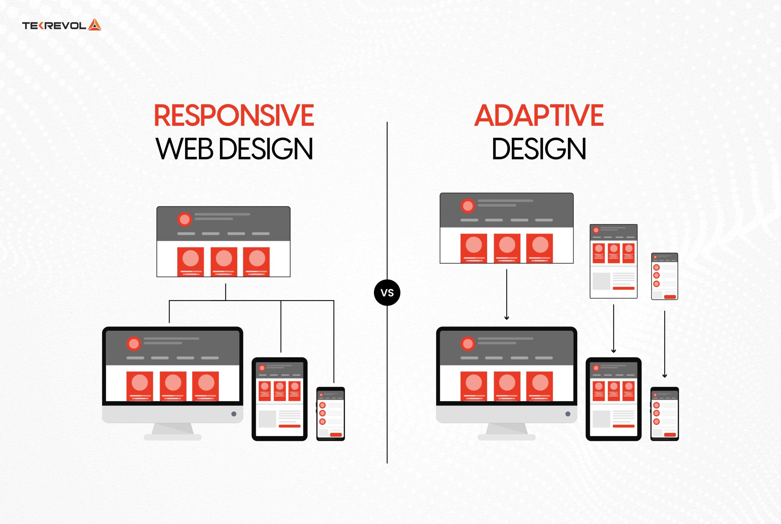
To find out the key difference between the two, let us first define what responsive and adaptive design mean: both concepts belong to web design and are meant to create the best user experience no matter the size of the device used.
Responsive Design
Responsive design uses a layout that is common and gets adjusted depending on the screen size in use. It utilizes a fluid grid framework, which employs relative measures such as percentages; as a result, its elements have relative size.
Additionally, flexible images scale within their containers using CSS properties such as max-width: 100 %. Media queries have a central role by applying styles relying upon the characteristics such as width and the orientation of the device.
This method is incredibly convenient, as it ensures compatibility with various devices and various dimensions of the screen without effort.
Adaptive Design
Adaptive design means multiple fixed layouts created to target such and such screen size to help achieve increased sharpness in user experience on different devices.
When a user accesses the site, the server determines the screen resolution and presents a page that has been tailored to such a screen size.
This method allows a fine level of control over the design aspects for each device and hence, can give a more personalized look to the site. However, it requires a vast amount of work in order to ensure that all these layouts are updated and managed efficiently.
Key Differences
- Flexibility: Responsive design is also more flexible, since it adapts to any screen sizes, whereas adaptive design is designed for a few specific screen sizes only.
- Development: Responsive design usually means that a single layout is incorporated, while adaptive layout is based on the layout that will work for a specific device.
- Performance: Optimized designs may well yield increased performance given that they are designed for individual devices; however, the latter have to deal with a wider range of devices.
- Confused between responsive and adaptive design??
- TekRevol’s experts will guide you to the best approach for your site
Key Elements of Responsive Web Design
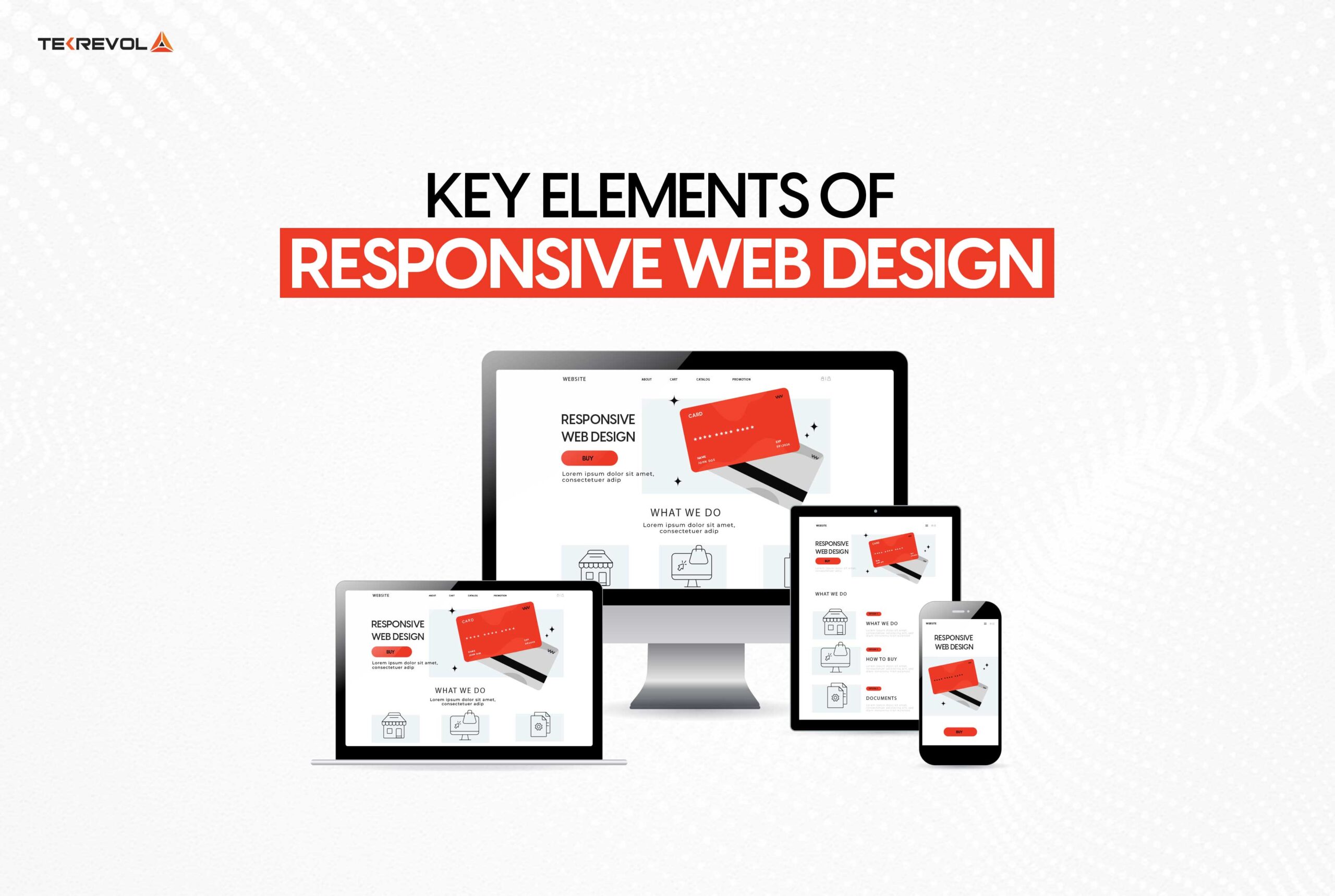
Flexible Layouts
A flexible layout acts as a grid structure where the contents can easily go through seamless transitions depending on the screen size. While flexible layouts do not use the predetermined width of containers, the elements adjust according to the relative sizes such as percentage.
Fluid Images
All the images in this layout float, and their size is adaptive to the size of the element that they are placed in. By using CSS techniques like max-width: 100%, images can easily scale to fit the screen while retaining their correct dimensions.
Media Queries
Media queries are CSS rules which can be styled based on the features of the media such as width, height and others or even the orientation. They are the basis of responsive design as it helps the designers to be able to work on different devices and adapt accordingly.
Best Practices for Responsive Web Design
Prioritize Mobile-First Design
Mobile first is designing for the small screen and then having to scale up your design for larger screens. This enables one to assure that functionalities work well on the mobile devices, especially at a time when the mobile users are increasing.
Use a Fluid Grid
The adoption of a fluid grid layout is crucial when designing the page that will be viewed on different platforms. It means using relative measures, for example, percentages instead of pixel-based sizes, so layouts change their sizes accordingly.
Optimize Images
Image optimization is important for keeping rapid site loading and ensuring that images are correctly displayed on all devices. Some of them include employing the formats such as WebP on the images, lazy loading, and delivering different sizes of images depending on the device in use.
Implement Responsive Typography
One more isolation should be made for the text: text should be readable both on stand alone devices and on devices that are interconnected through the Internet. Setting font sizes, line heights and margins in relative units such as ems or rems makes typography inclusive for all displays.
Leverage Viewport Meta Tag
The viewport meta tag is a tag that informs the browser how it should control the dimensions of the particular webpage and the zoom control. This is important for the reason that you need to be able to view your Website on different devices and formats.
Test Across Devices
It is a must to test often on multiple devices and browsers. These issues can be solved with the help of tools such as BrowserStack or real device testing which will provide the same experience as on different platforms.
Common Pitfalls in Responsive Web Design
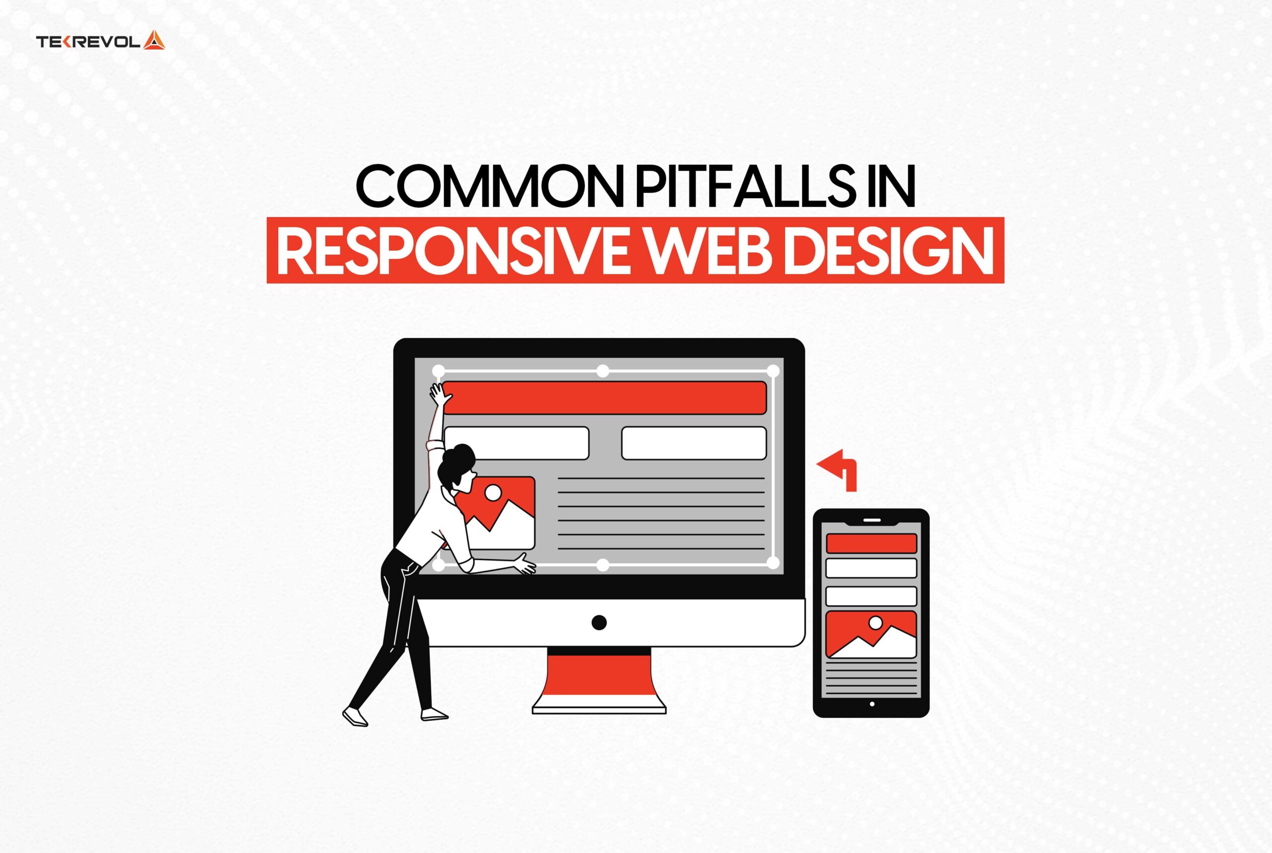
Ignoring Performance Optimization
On the other hand, responsive design may cause various problems with performance depending on how it is used. Make sure that your site has few http requests, well written code and good use of browser caching.
Overcomplicating Navigation
The navigation should be equally responsive and easily found on all the practices and devices used. Do not put too many links on the site and make sure that the targets of links are large enough to be seen on a cell phone.
Inconsistent Breakpoints
Responsive design is based on the idea of responsiveness and by definition has multiple breakpoints at which it changes to suit the device being used to view the website. Lack of good breakpoints or improper selection of breakpoints lead to a poor user experience. One must decide where the change in layout will occur and stick to those points as a guideline to switch between the layouts.
- Worried about pitfalls in responsive design?
- Avoid common mistakes with TekRevol’s expert guidance.
Implementing Responsive Web Design: A Step-by-Step Guide
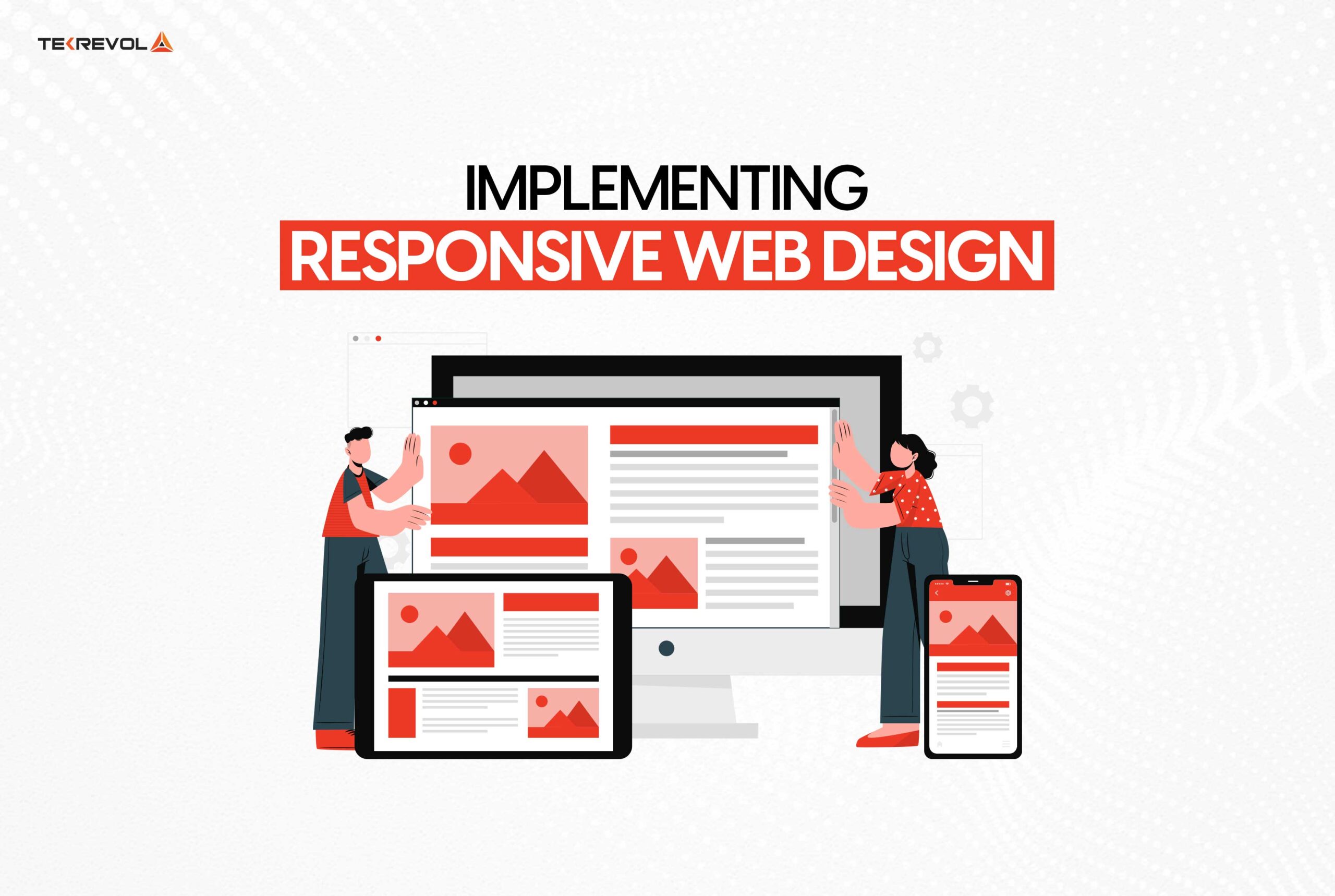
Step 1: Define Your Breakpoints
Breakpoints are the screen widths at which your design will adjust. Common breakpoints include:
- Small devices (phones): up to 600px
- Medium devices (tablets): 600px to 768px
- Large devices (desktops): 768px and above
Step 2: Create a Fluid Grid
In your layout, use a concept of a fluid grid. This is done by use of widths margins and paddings in relative units such as the percentage or em instead of in pixels.
Step 3: Optimize Images and Media
Make sure the images, and other media elements applied to the site are optimally scalable. Make images scale to their container using CSS properties such as max-width.
Step 4: Apply Media Queries
Employ media queries so that styles change in accordance with the features of the device. This way, you can define specific content for different window sizes.
Step 5: Test and Iterate
It is important to check your website on different devices and browsers to avoid unexpected differences. For more thorough testing, it is possible to use the integrated tools of the Chrome browser or invite services like BrowserStack.
The Role of TekRevol as a Leading Website Development Company
Here at TekRevol, we know that application of responsive web design is crucial for creating great websites that are of the greatest quality and usable.
Utilizing the best practices of the modern web development process, we guarantee that every website developed at TekRevol functions flawlessly on any device. This commitment not only optimizes the experience of the users but also increases interaction, which is crucial for the digital outcomes of our clients.
The Expertise of TekRevol as a Premier Web Development Company in Dubai
TekRevol is a renowned Web Development Company in Dubai that is fueled by the quest for excellence in web design trends and technologies. Due to the rapidly evolving business environment of Dubai, websites must be adaptive and work well in addressing different client segments.
As a result, concentrating on the responsive web design practice helps TekRevol to help businesses from Dubai and worldwide successfully implement their digital strategies.
- Looking for top web development in Dubai?
- TekRevol delivers cutting-edge, responsive design.
Looking for top web development in Dubai?
TekRevol delivers cutting-edge, responsive design.
Transform Your Website Today!
Final Thoughts!
Having a responsive web design is a necessity nowadays because everyone uses multiple devices to access the internet. Learning the principles of responsive web design will help to guarantee that your site will be good and optimal on each device.
As a Website Development Company or Web Development Company in Dubai, responsive design is highly beneficial in not only improving customer engagement but also Google search rankings and your company’s online presence. Emphasize on responsive web design to be one step ahead in the modern competitive environment.
Adhering to the recommended principles and refraining from mistakes, you will have a visually appealing and functional website for different platforms. Finally, there is testing and refinement, and never ceasing to learn about new trends and techniques in the field of responsive web design.


